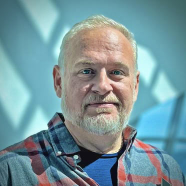
I'm Jon Truelove and I'm into the art and science of creative communication.
Personal I live with my wife and two kids—and Siberian Forest Cat, Cockapoo, and a new orange kitten—in a small town located between Milwaukee and Madison (in Wisconsin). When not driving the kids around, I like writing and playing music on the guitar, piano, and cello. I also enjoy photography (well, mostly videography and video editing). I hike the National Scenic Ice Age Trail (which winds through my town) quite frequently.
Work With every new project, I aspire to create the most successful and thoughtfully conceived and designed experience possible. I know nothing I create is perfect and I try to learn from every experience. I work best as part of a dynamic team.
Hey, and of course feel more than free to contact me if you want to say hello, talk shop, etc.

Some of My Work
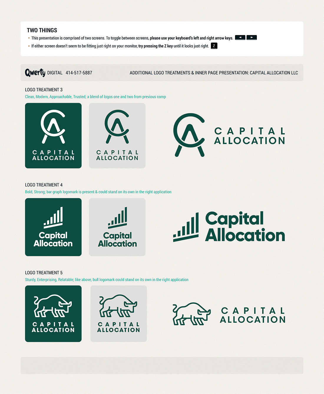
Captial Allocation
Branding and website design, 2019 – 2024
Design (Figma, Photoshop, Illustrator), HTML, CSS, JavaScript
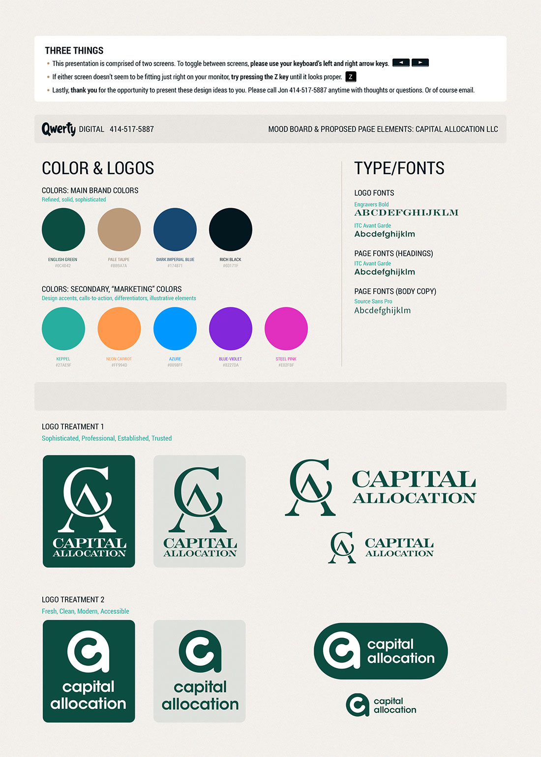
The financial software company known as OptionVue wanted to rebrand as Capital Allocation. I created their logo and branding from the ground up. I also worked closely with programmers on their end to create the look and feel for the "back end" where software subscribers could manage their account, take advantage of subscriber-only content, etc. View the Captial Allocation homepage and branding proposals in a modal (pop-up). Also: Interact with the page and view my HTML, CSS, JavaScript in my sandbox environment on codepen.io (in a new window).
Qwerty Digital
Branding and website design, June 2023
Design (Figma, Photoshop, Illustrator), HTML, CSS, JavaScript
I created this fun, colorful website including branding from the ground up as the face of my freelance business. All of the markup/coding is from scratch and is based off my own personal CSS framework (you know, rather than Bootstrap or Foundation or the like). Check out the homepage in my sandbox environment on codepen.io (in a new tab or window).
Rummager.com
Branding and website design, May 2020 – current
Design (Figma, Photoshop, Illustrator), HTML, CSS, JavaScript
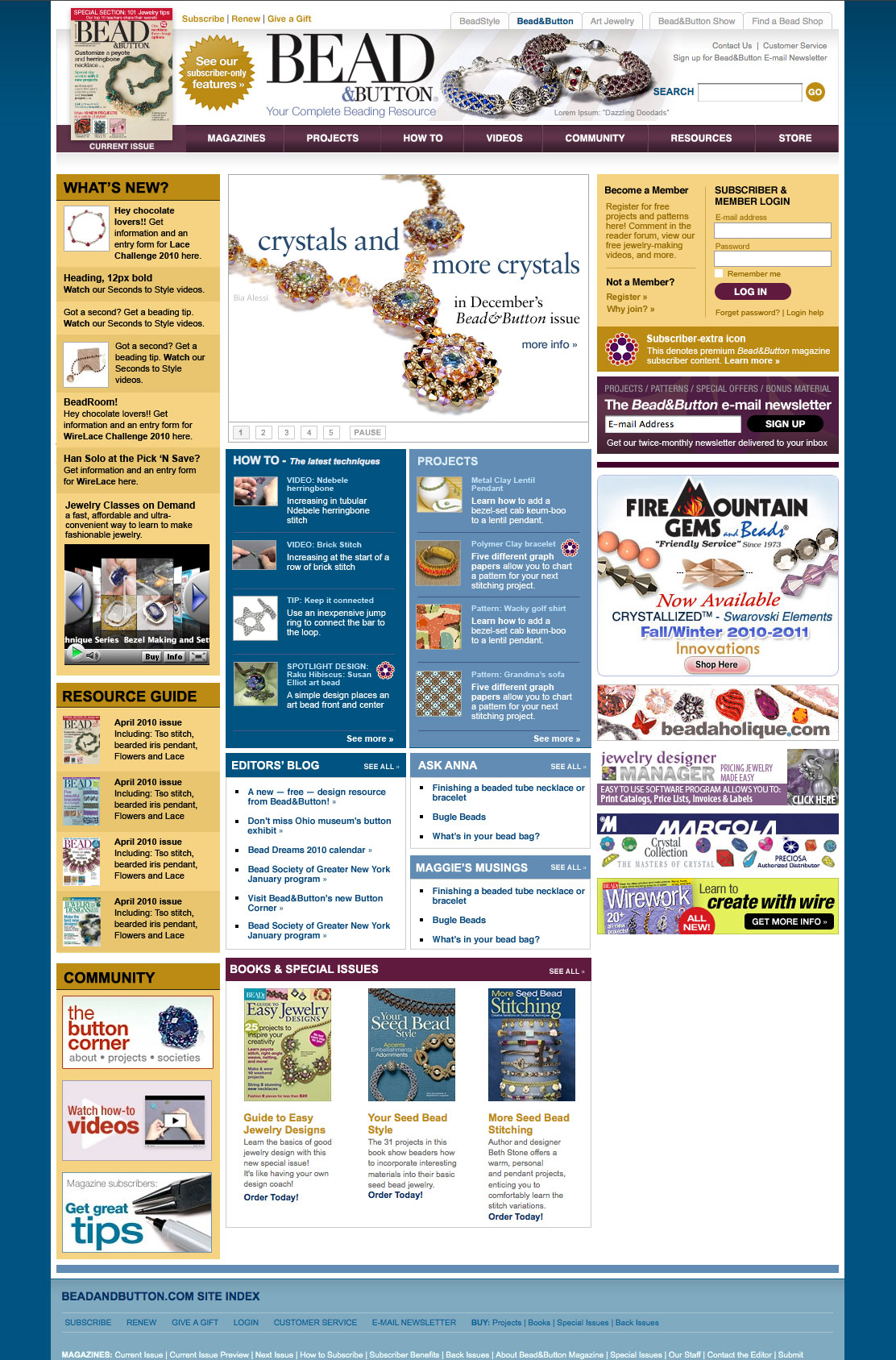
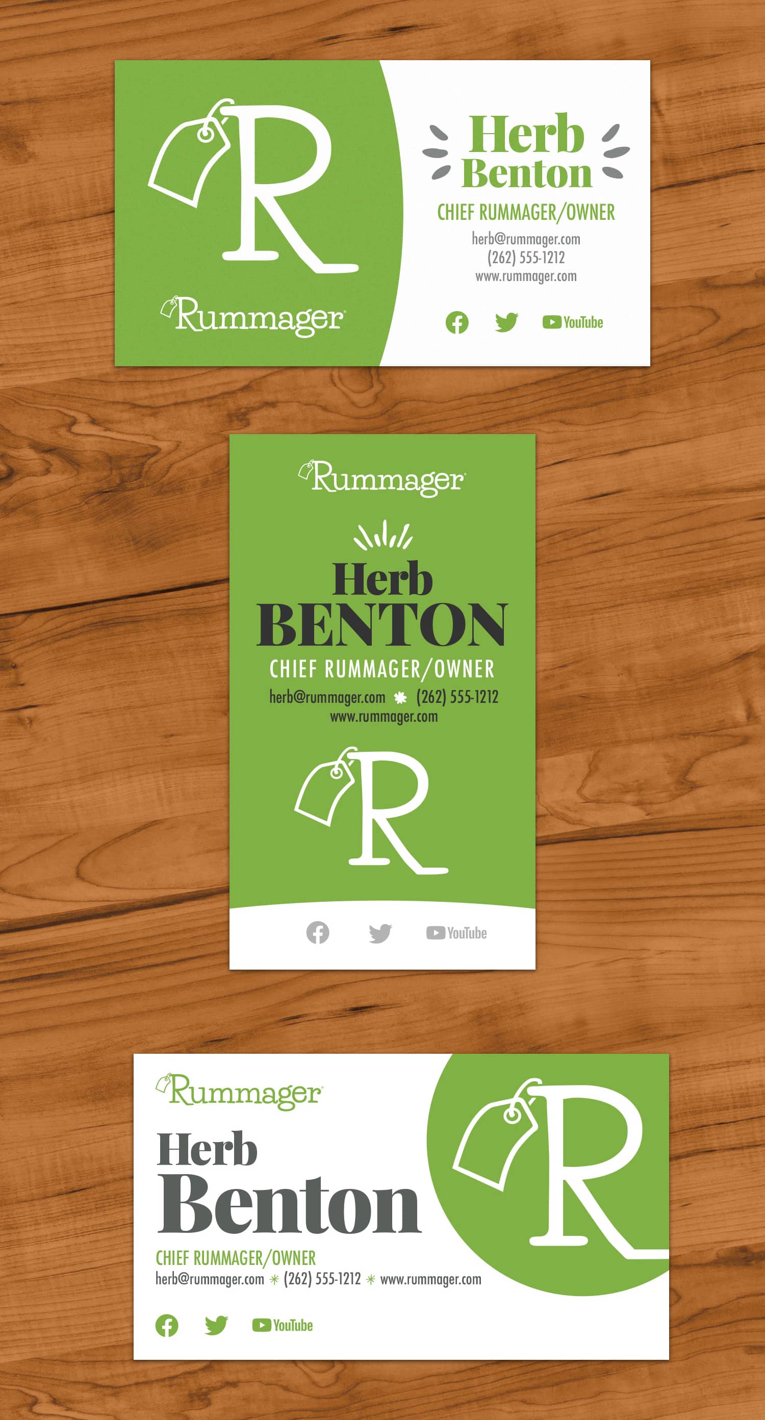
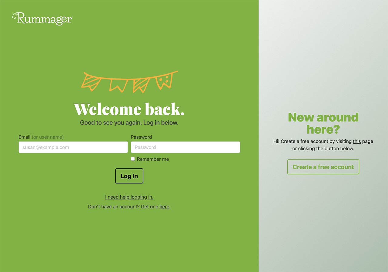
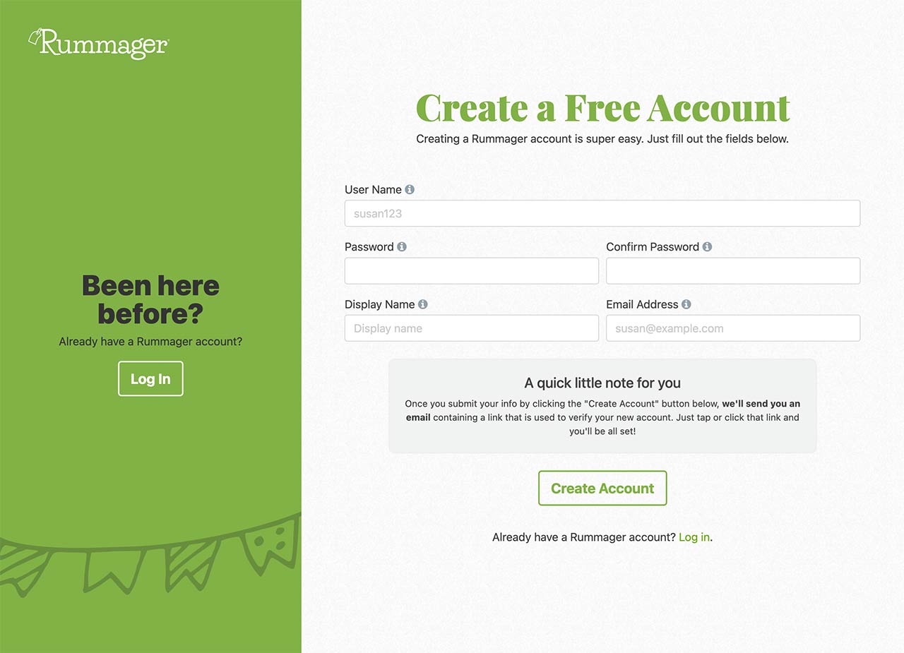
The owner of the all-new for 2020 Rummager.com has a thorough business plan and needed focused, professional branding that wasn't too cold and that was friendly and professional at the same time. To achieve this goal, I've written breezy copy when appropriate; I've also used a warm but modern color palette and lean on drawn illustrative elements when possible to try to add a touch of humanity. Check out some Rummager.com work.
Prestwick Golf Group: Sister Bay Furniture Landing Page
Landing page to showcase new furniture products, January 2020
HTML, CSS, Design (Figma, Photoshop, Illustrator)
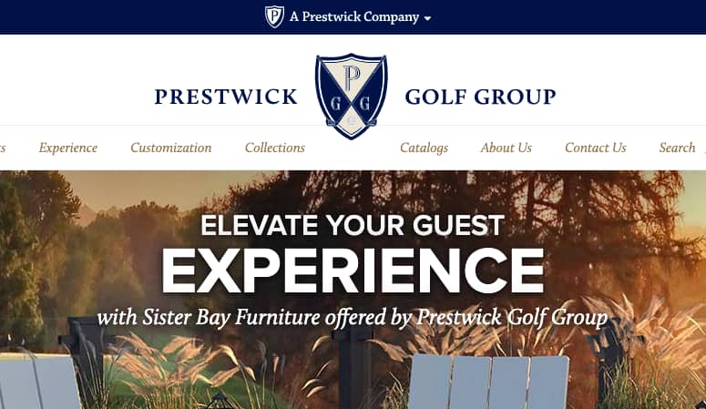
I was lead web designer on this particular project for The Prestwick Group. The Prestwick Group had added a line of furniture to their lineup and wanted a dedicated landing page to showcase some of the product as well as show off some of the key selling points of the furniture. See it here.
Generac Power Zone® Landing Page Concept
Initial design concept to inform the look and feel of landing page, January 2018
Design (Photoshop, Illustrator)
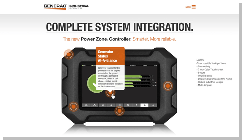
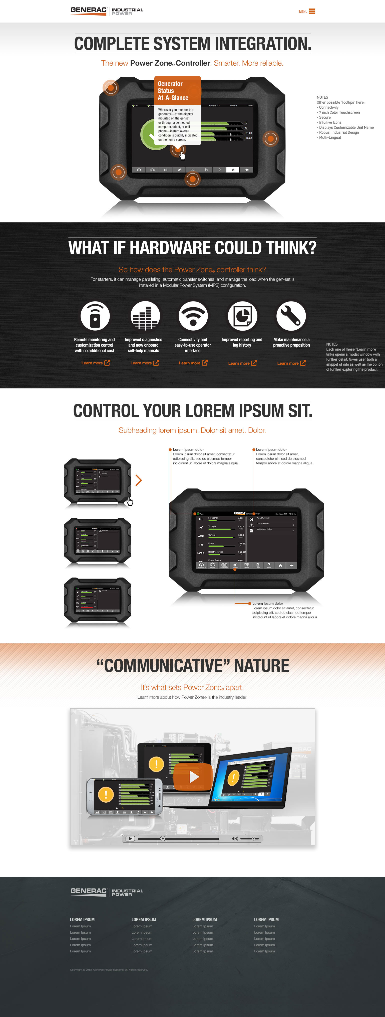
I was lead designer on this project for Generac Power Systems. Generac had come up with an innovative power generator controller and wanted to tell a visual, engaging story about the product. Of course they needed to include plenty of information about the controller but at the same time they wanted a handsome-looking presentation. Check out the concept.
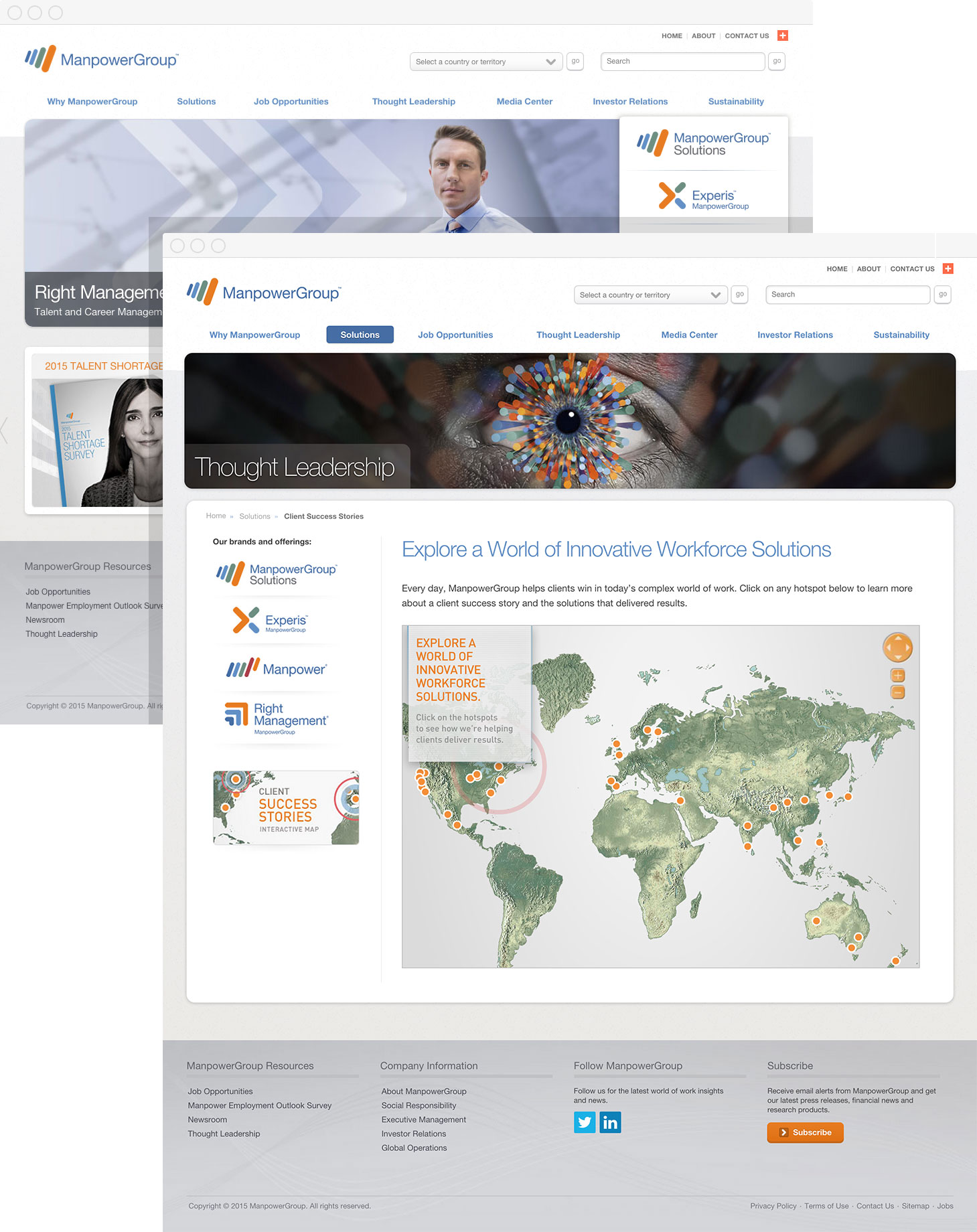
ManpowerGroup at World Economic Forum 2016
Site to promote ManpowerGroup's January 2016 presence in Davos
Design, HTML, CSS, JavaScript (jQuery)
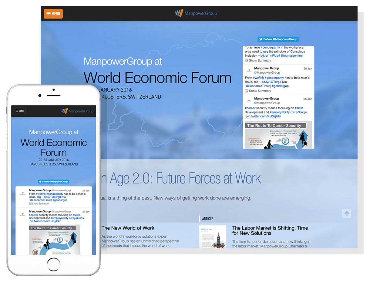
I was the sole designer on this somewhat high-profile project (we have/had four executives from the company speak at the conference). I worked closely with our Global Communications department to gather requirements and content; additionally, they wanted something that showcased our existing breadth of related content presented in a clean, sophisticated fashion. View larger version.
Manpower coretracker
Concept to inform usability and design of job applicant system, August 2015
Design (Photoshop, Illustrator)
For me, this was a bit of a pie-in-the-sky look at what a couple screens of a job applicant system might look like. I needed to adhere to our rather strict brand guidelines while also mulling usability questions such as: Which data is most important to the person using the software? Of course the answer was something along the lines of, "It's all important." I proposed the structure you see here. I really wanted to keep three particular sections right upfront and never bury any other information. Navigation had to be dead simple, so I kept as much as possible of the nav in visual format (you know, using icons rather text). A better view.
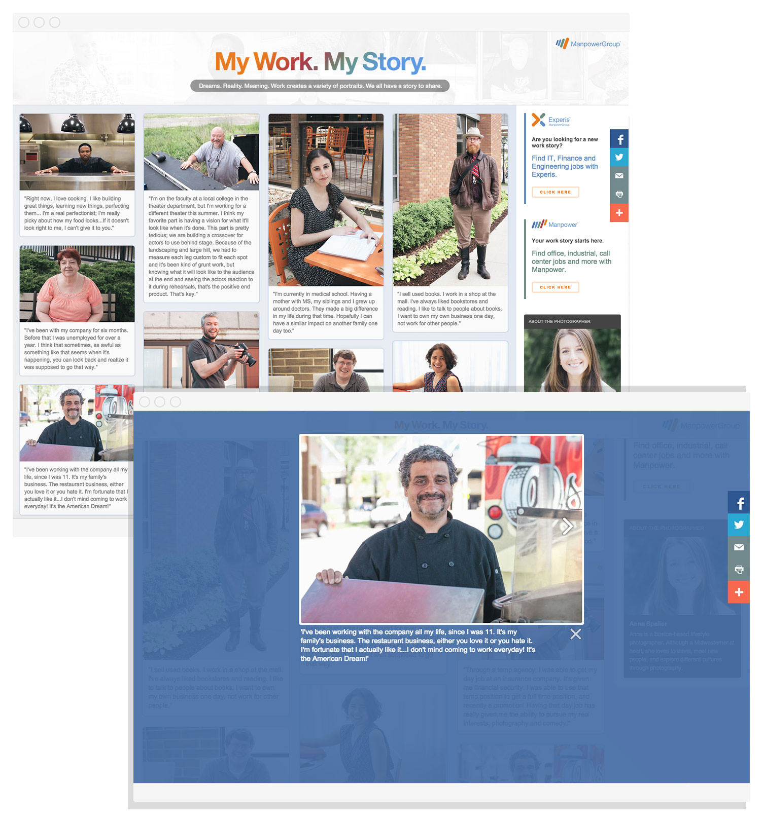
My Work. My Story.
Website to accompany national marketing campaign, July 2015
Design, HTML, CSS, JavaScript (jQuery)
Our team wanted a "Humans of New York" type campaign that highlights real people in the American workforce and their stories.
To get the images to tile, I implemented Mosaic Flow (v0.2.5); for the modals I used Lightbox 2. The site was supported via Facebook, Twitter, and Instagram, so I also worked with the team on social-network scheduling, messaging and image creation.
ManpowerGroup 2015 Talent Shortage Survey
One-Pager / Microsite, May 2015
HTML, CSS, JavaScript (jQuery)
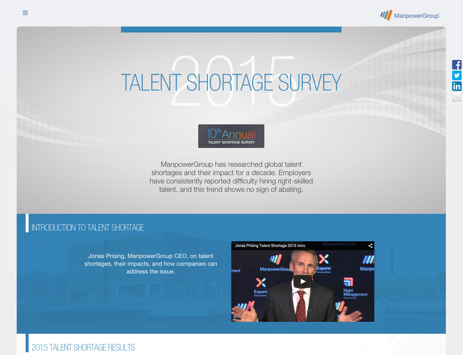
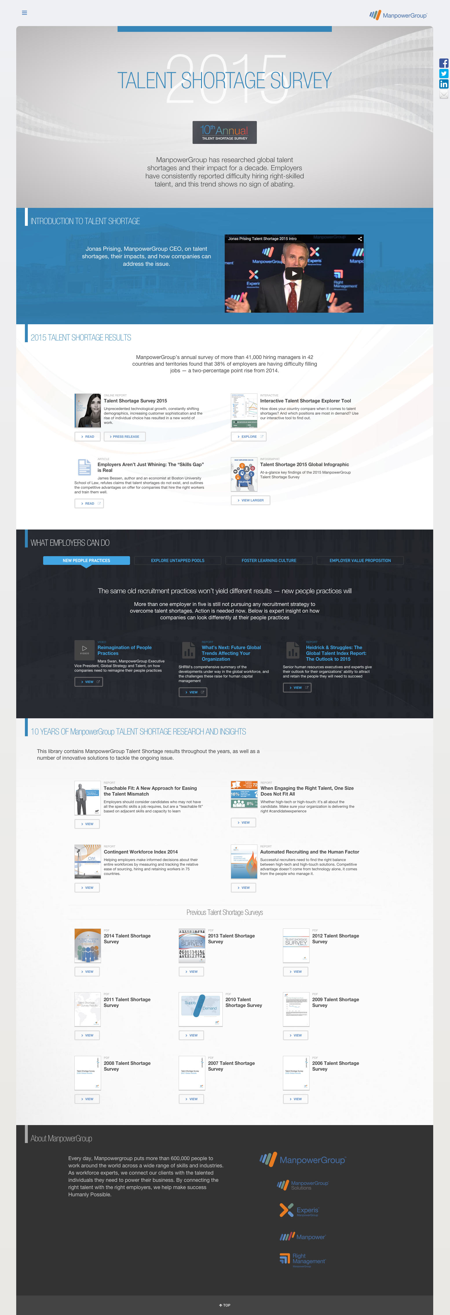
I lead the design of this long one-pager (or "microsite" as folks began to refer to it) as part of our global marketing campaign around our annual Talent Shortage Survey. The microsite needed to offer loads of information in a shoppable, quick-scan sort of fashion. See a screenshot here.
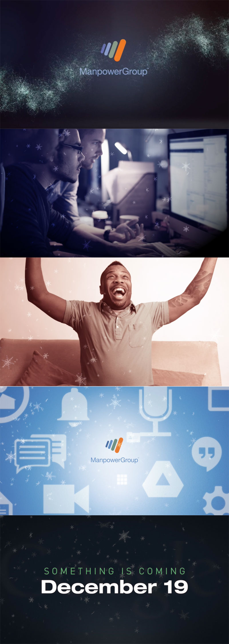
ManpowerGroup: Internal Buzz Generator
Kiosk Video, December 2014
Photoshop, After Effects, Final Cut Pro
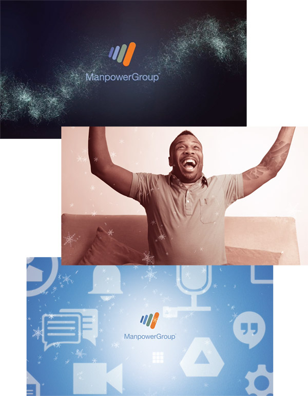
I had such a blast making this; I just had to include this one. I was given a script and was set free to visualize this internal video (put into a large kiosk) in any way I wanted. I also narrated it. It was very well received. I know it's not the best way to showcase web design talent, but maybe it could be of some use at least communicating some of my general visual sensibilities. I put this video and a few others on a YouTube page here.
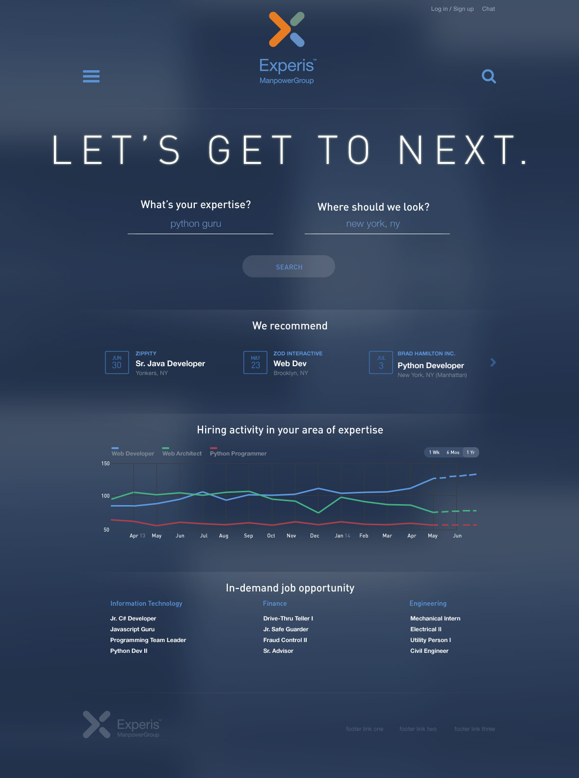
Experis Candidate Experience
Global Site (includes responsive site + iOS app)
Photoshop, HTML, CSS
This is the global, job-candidate-facing website for the Experis brand. I had no brand-specific images to work with, and was told to try a look "other than white." We also wanted the Experis brand to stand apart from the Manpower brand. The result is this rather-different look that leans on its blue hue as well as typography as its differentiator(s).

And some more

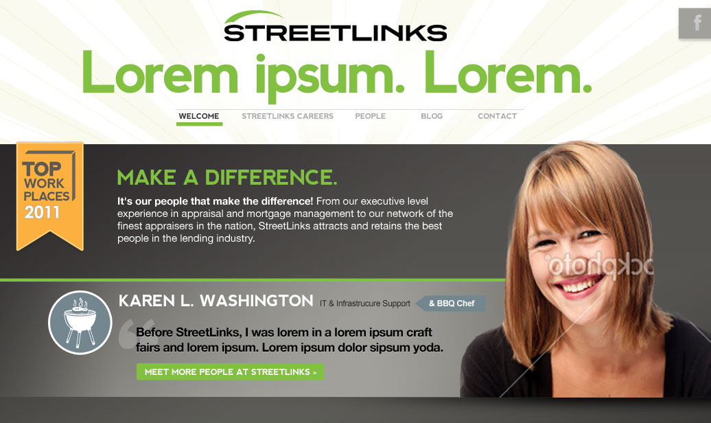
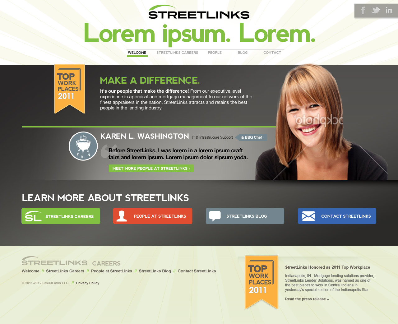
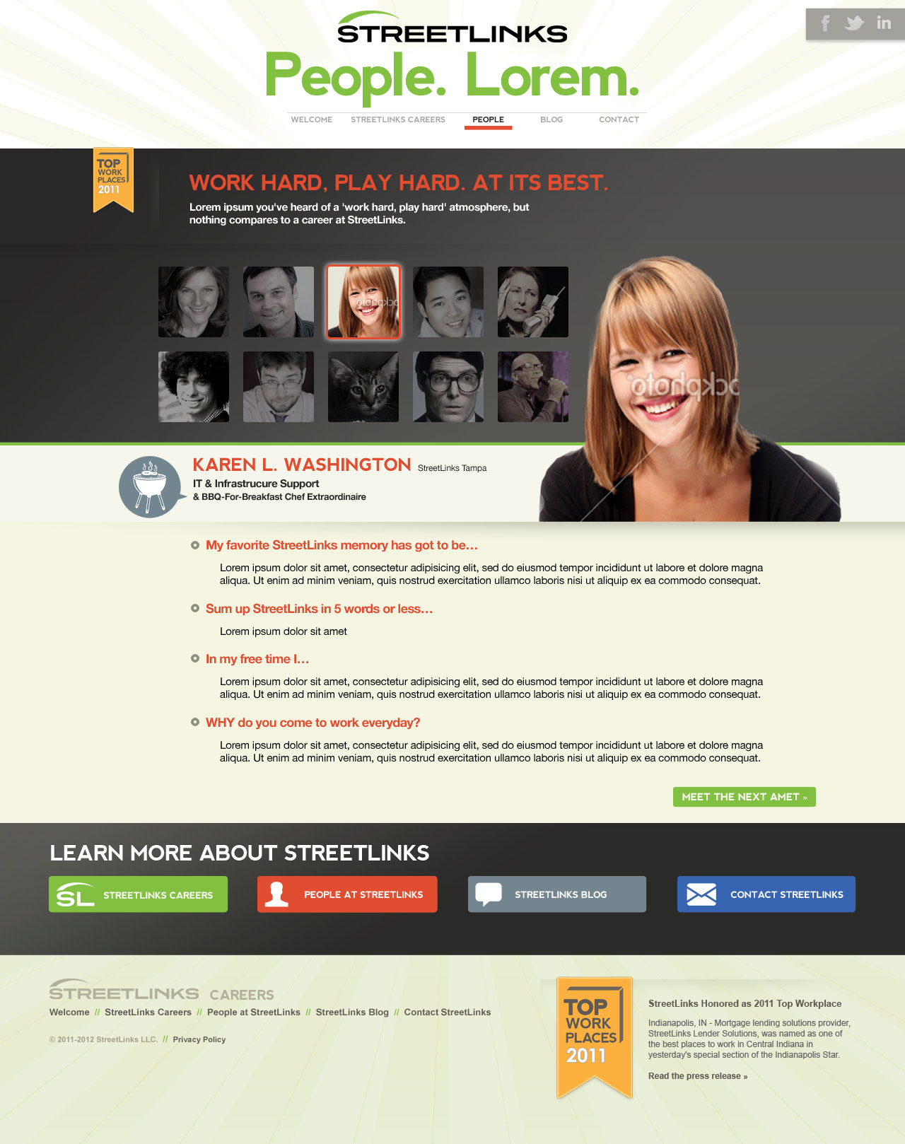
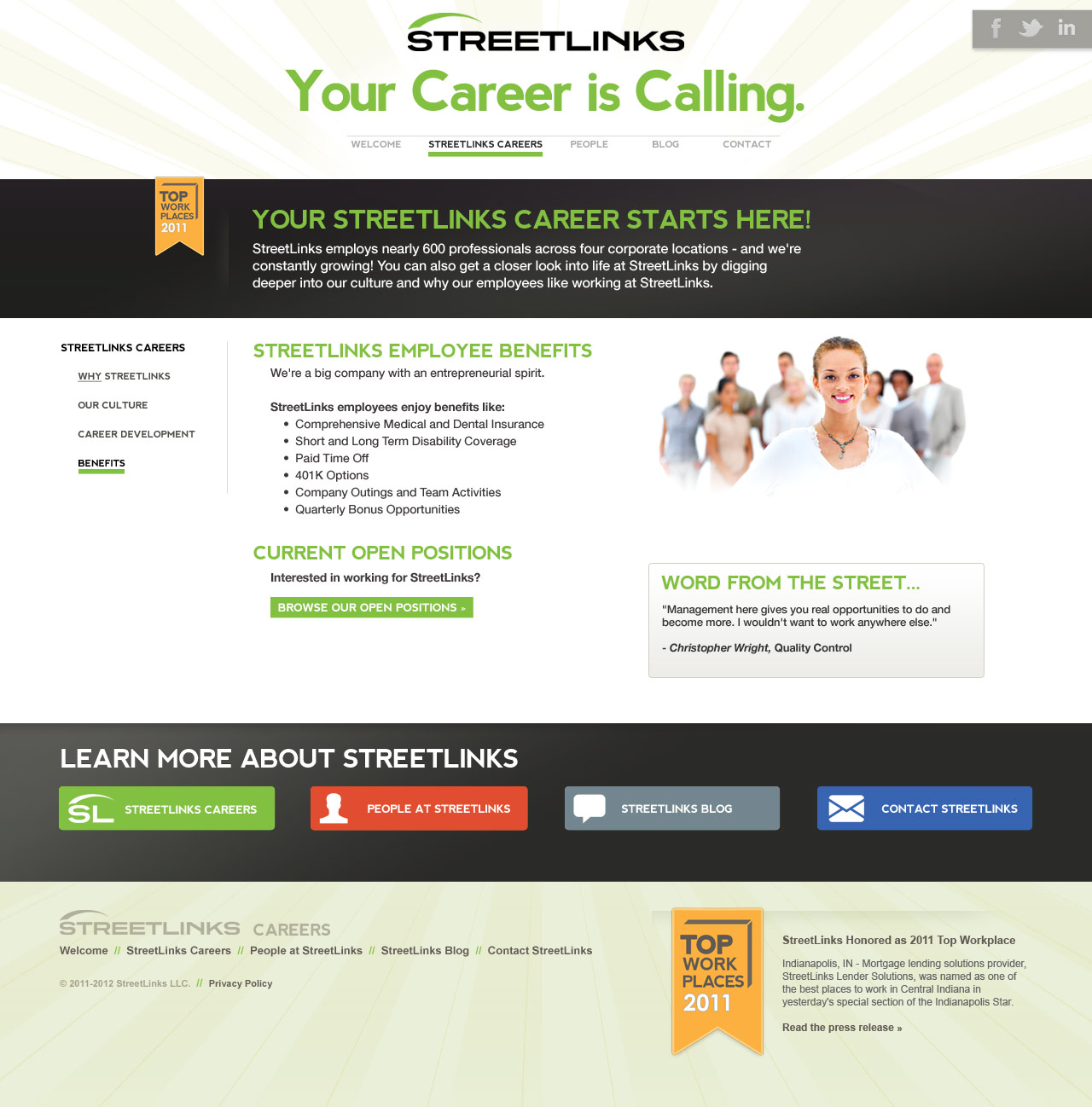
StreetLinks
A site to introduce StreetLinks, its philosophies, its people
Photoshop, HTML, CSS, jQuery

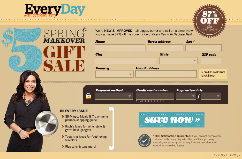
Everyday with Rachel Ray Promo
Promotional pieces
Art Direction, Photoshop, HTML, CSS
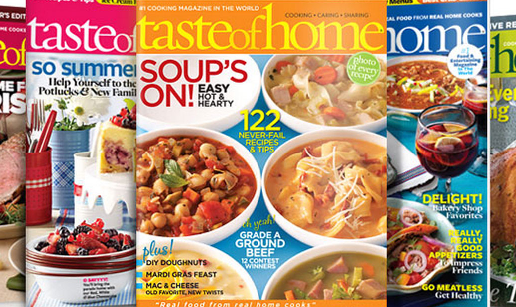
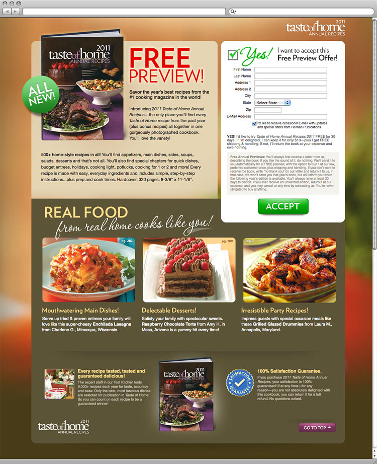
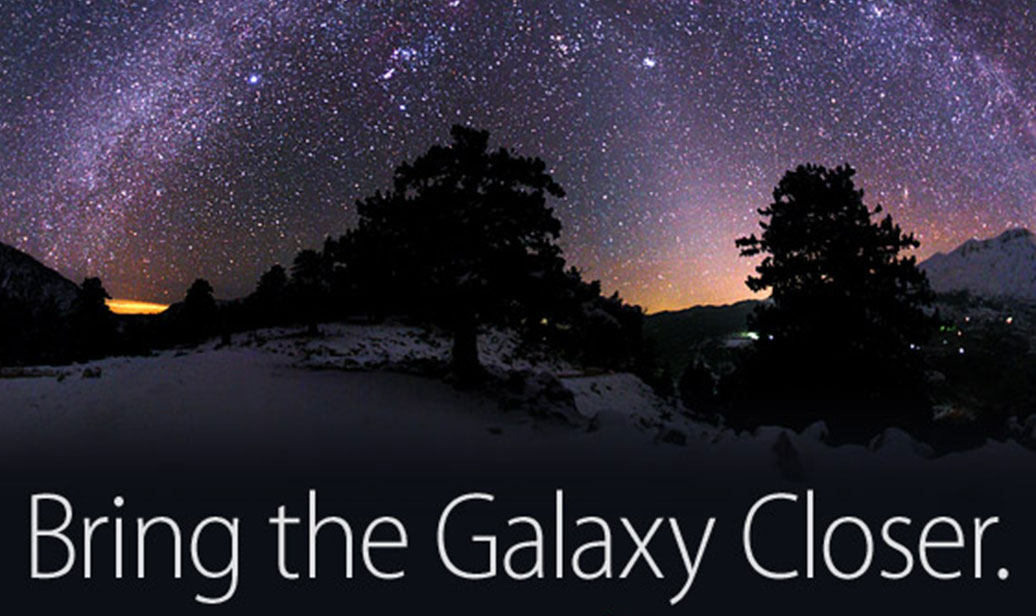
Taste of Home Microsite
Microsite sellin' subscriptions
Photoshop, HTML, CSS, jQuery
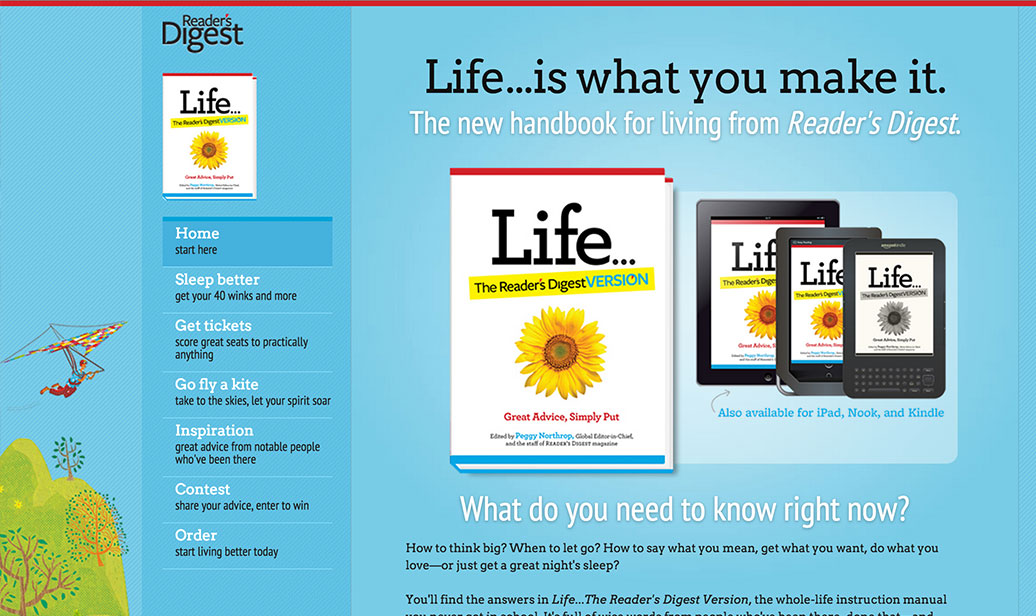
Reader's Digest Life
Promotional microsite
Photoshop, HTML, CSS, jQuery
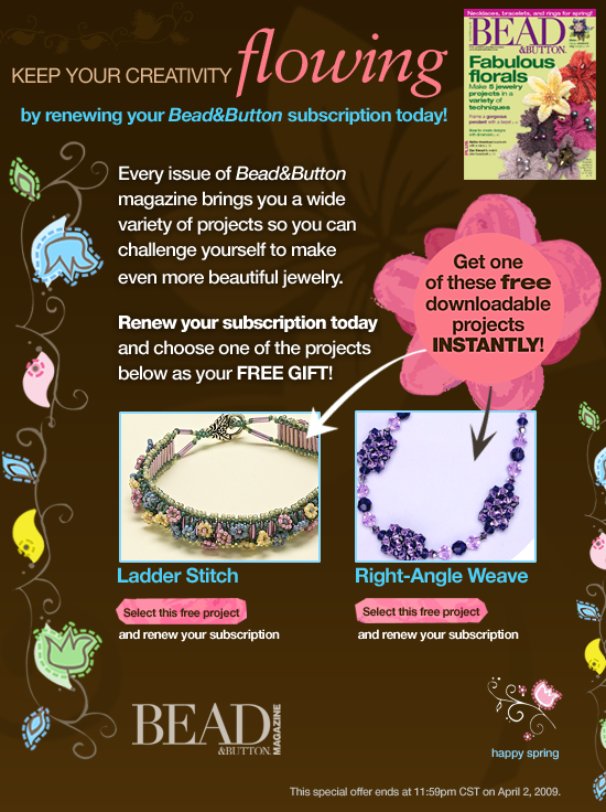
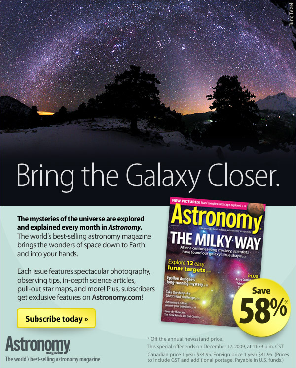
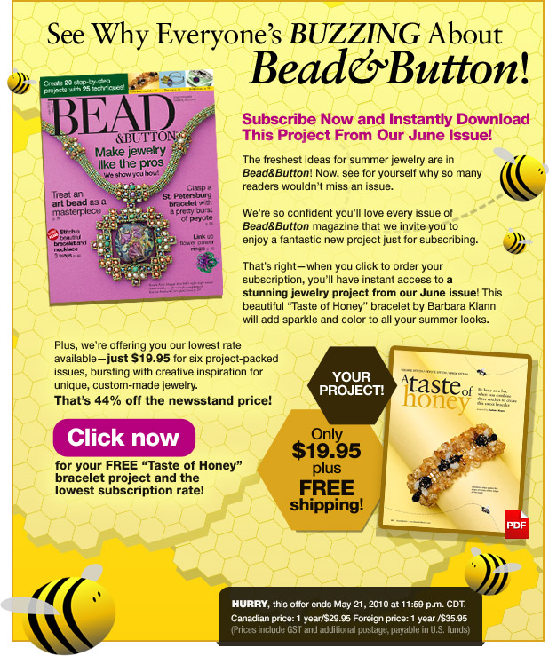
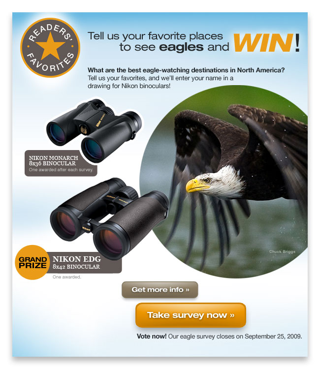
A collection of HTML emails
Loads of fun, colorful emails
Photoshop, HTML, CSS
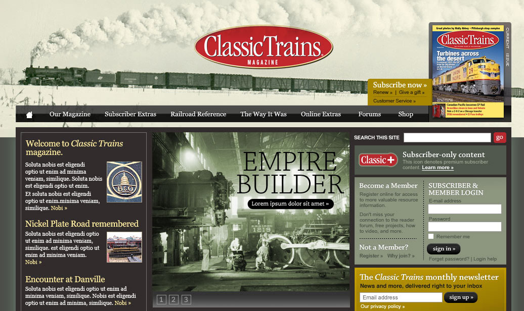
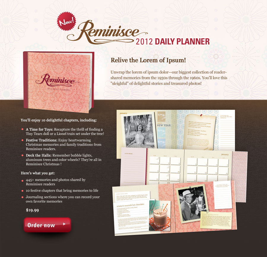
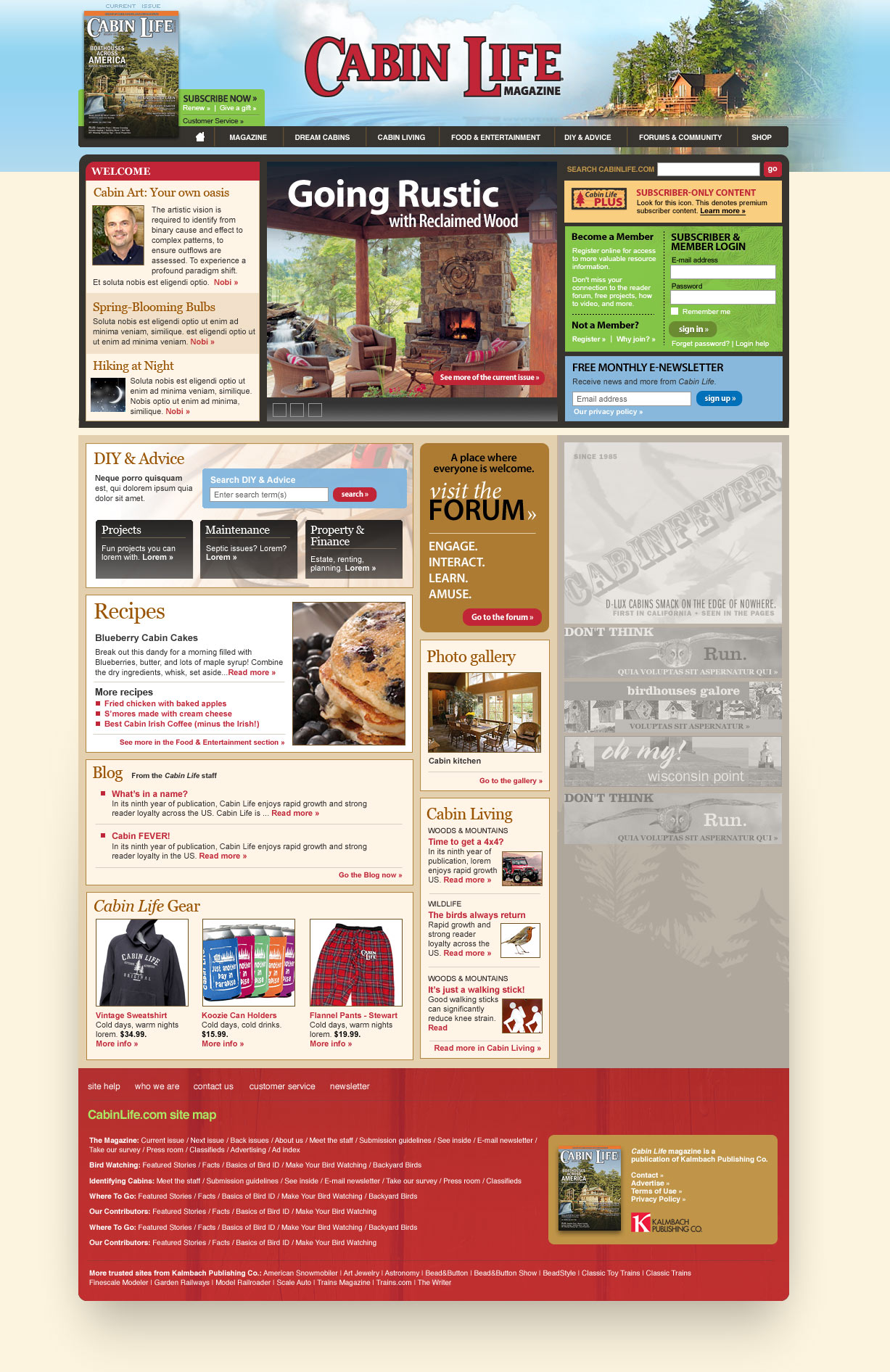
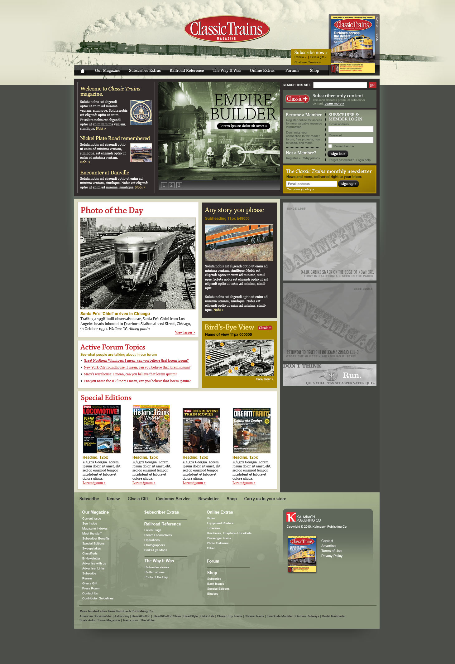
A handful of sites I designed
For various magazines
Photoshop, HTML, CSS, jQuery
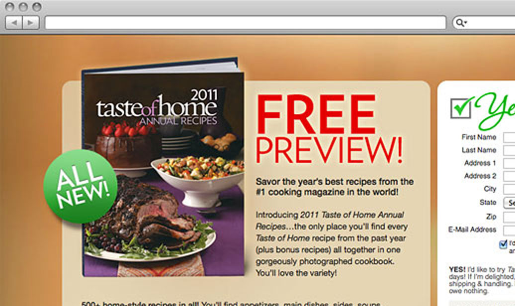
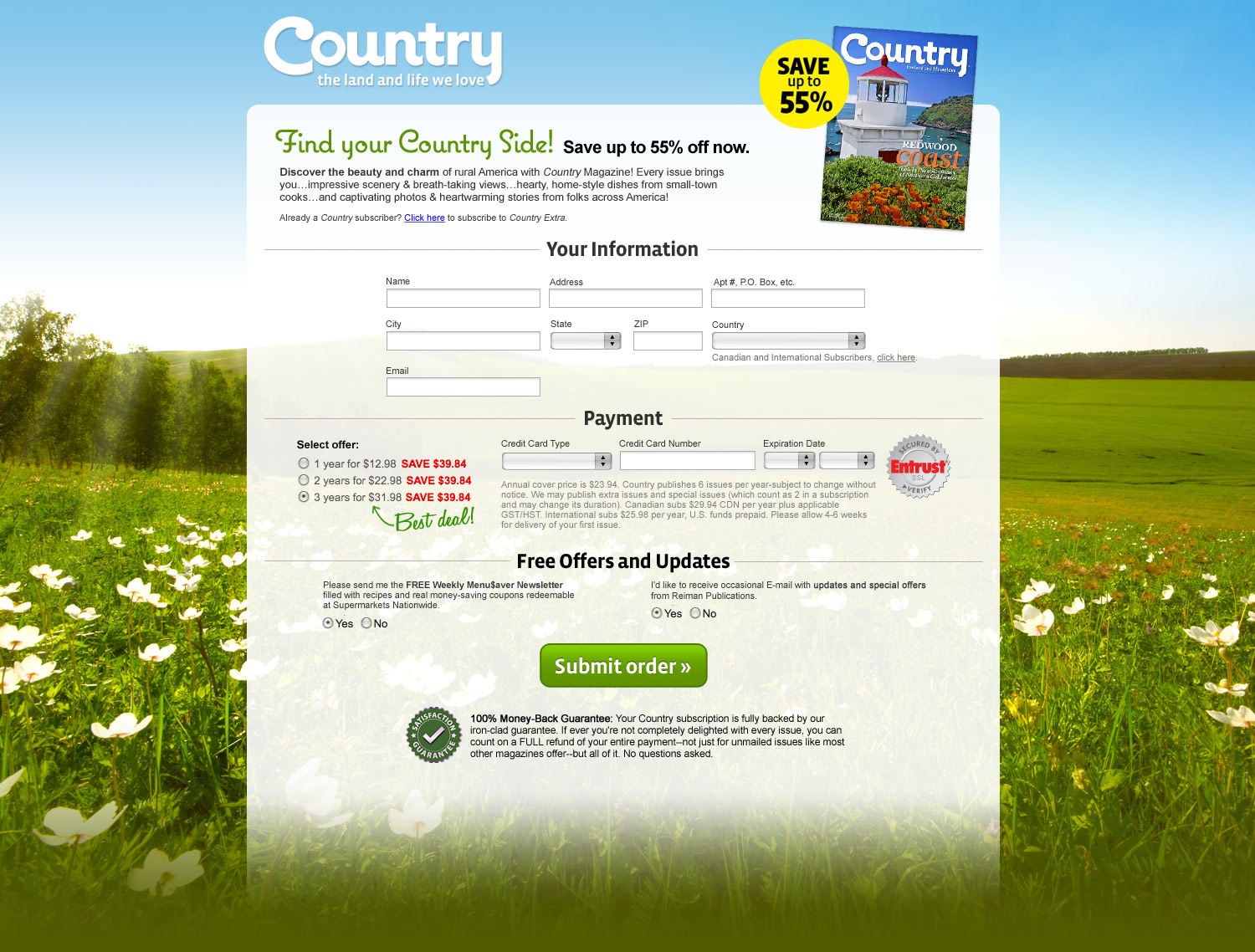
A handful of order pages I designed
For various magazines
Photoshop, HTML, CSS, jQuery
Work With every new project, I aspire to create the most successful and well conceived and thoughtfully designed experience possible. I know nothing I create is perfect and I try to learn from every experience. I work best as part of a dynamic team but of course can execute when going solo.
Try opening another modal from here.
A little more: I feel warm and cozy designing in Photoshop or designing in the browser writing and implementing HTML+CSS+JavaScript, and I feel equally cozy in a command-line version control system, content management systems large and small, or knee-deep in code.




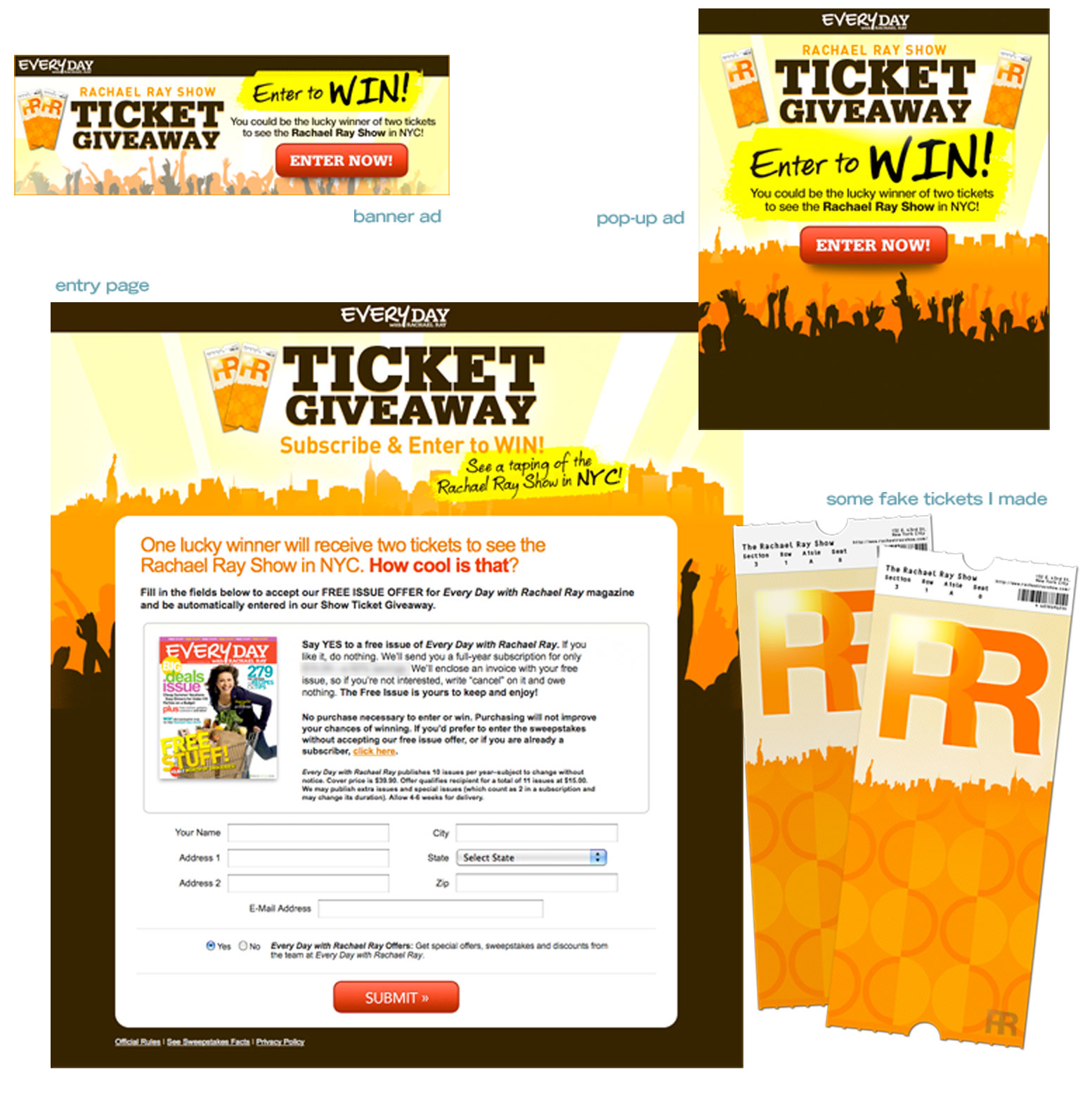
This job posed some issues because of brand overlap; that is, the Every Day with Rachael Ray magazine brand was promoting two tickets to see the Rachael Ray Show. Despite the magazine and the show being focused on the exact same person, both have different looks, different branding, different sites. And because of the infrequent-to-non-existent cross promotion, the two aren't so much sister brands as, you know, just related.
Plus, the offer itself had some issues. For example, tickets to the show are already free. Additionally, there was no travel included which would have been nice to feature graphically (think action, flying plane, busy airports, etc.). To generate some visual energy, I first thought it might be good to at least show some photos of Rachael doing the show, some of the audience, etc. Unfortunately, I was not privy to such images, so I focused on the inherent excitement of the big city and showed a jazzed-up crowd (in silhouette) and created a subtle spotlight effect radiating over the cityscape. I also included an image of the tickets (the actual tickets are much less exciting) to add some palpability to it all.
There were two different offers, one involving a reduced-price subscription with entry, so there were two versions of all the pieces: banner ads, pop-ups, emails, landing pages/order pages, confirmation pages, and confirmation emails.
